Difference Between Histogram and Bar Chart
- Soham Shinde
- Dec 15, 2021
- 3 min read
When I was analyzing the data and finding relations and count between the variables/attributes, I always had doubt about tool selection. After reading some blogs and learning about Histograms and Bar chart. I got to know the main difference. I going to share my learnings in this blog. Lets explore the differences and the overview in this blog:
What is Histogram?
What is Bar chart?
When to use Histogram?
When to use Bar Chart?
1. What is Histogram?
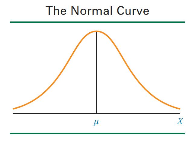
Histogram denotes the frequency on the Y-axis and numerical range of the ATTRIBUTE (Sales, Height, Weight, Temperature, Working hours of workers, Shipment Price) in the given population on X-axis. It is used only for the numerical data. For example, if we have the data of sales according tor the products. We can plot a Histogram that will show what was the highest frequency for sales in the given dataset. We always try to make the histogram close to Normal Distribution. This helps us to make insights from the data.
Example:
If we have data of the shipment price like given below:

This table has price in dollars of shipments from customers. We will plot the Histogram in Excel to understand how it looks like.
Histogram in Excel:

The above histogram is plotted in Excel. I have taken shipment price for more than 500 customers and plotted a histogram. We can see the distribution of the shipment price. The data is automatically divided into the groups of $3 on X-axis. We can see that there are 15 customers who paid in the range of $45 and $47 to ship their material.
This plot gives us the answers which the business problems needs to solve. This is the tool we use to answers questions like, what should be the price for the shipments to get the most sales, how many people ship their product below $30 or how many people are above $70. We have to keep in mind that we have taken range of shipments from $1 to $100. I have considered a hypothetical situation where I have taken the shipment price as $1. We have to make sure that the chart is Normal distribution. I have written another blog on Normal distribution to explain in detail.
2. What is Bar Chart?
Bar chart is the chart which has categorical variable on X-axis and Y-axis has the numerical variable. Let's consider an example, if we have number of people shipping based on state. So state will be on the X-axis and Y-axis will have the number of people.

Bar chart:

3. When to use Histogram?
Histogram is used when we have to find the distribution of the data. That means, how well the data is distributed from the mean. We want the data to be normally distributed. If we have to find the distribution of height range in the World, we can use Histogram.
4. When to use Bar Chart?
Bar chart is one of the simplest chart and very useful chart in data analysis. We can use the chart when we have categorical variable on X-axis and numerical on Y-axis. For example, if we have to find the number of shipments processes in each hub daily, then we will have Hub name on X-axis and Y- axis we will have shipments sorted/processed.
Hope now, you guys are clear what is Histogram, bar chart, their difference and when to use them. Let me know how you is my blog and your thoughts on bar chart and histogram.
Thanks,
Soham Sanjay Shinde

Comments